This small business is was initially looking for an image based logo, designed around an illustration they discovered on my Instagram. As I sold this image as a print I wanted to make sure that I could create something that was to similar but had its own individuality in order to make it stand out to her audience.

The main changes as you can see from the image was to alter the background and typeface whilst matching the colour pallet to her current website. By removing some layering from the initial image and aligning the type i was able to create a logo which fills the desires of the client whilst creating a recognizable. As the client wanted the backdrop to include simple flowers, we also decided to include there floral shapes in the imagery which gave a sense of symmetry to the image.
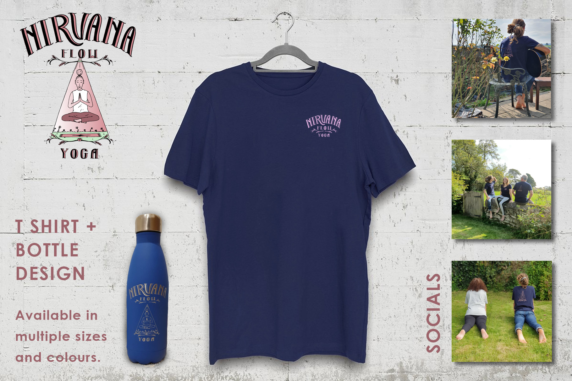
I later went on to produce some initial imagery for her website and social media using a number of yoga based props in order to help her improve the visual stimuli on the website. Here are a few examples along with some product shots of afew of the edits I did of the design to make it ready for print.